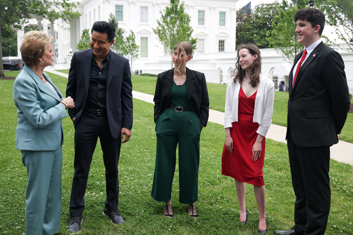
The Presidential 1776 Award competition was set up by the Trump administration to honor the U.S.’s 250th birthday with a civics contest for high school students.
But the family of Aangad Singh, 15, believes he may have been kept out of the competition’s final because of his Sikh background and visible turban, NOTUS reports.
Singh, a rising high school junior who lives in Connecticut, entered the competition in February just like other high school students around the country. He scored well enough to reach the finals in Washington, D.C., at the end of June and make the final eight. But his elimination after that left his family—and many of his competitors—puzzled.
The Singh family didn’t think Aangad had done poorly, but there wasn’t a live scoreboard. Other contestants told them after the competition that they were sure Aangad had won and were shocked that he wasn’t in the top three. When Aangad’s mother, Ramandeep, asked an official with the Department of Education, which helped run the contest, for the final scores, the official told her that was proprietary information.
So, the Singh family waited until the competition was televised on CBS three weeks later, and Aangad was shocked to learn some of his correct answers were labeled wrong.
In one instance, Aangad was asked to give four examples where federal courts have jurisdiction as outlined in Article 3 of the Constitution.
Two of his answers—“Parties of state and citizens of another state,” and “Case with state and foreign nation”—were marked wrong. He showed his father a copy of the Constitution showing that his answers were right.
In another instance, during a lightning round, Aangad was asked “Which amendment ended slavery?” and his answer was marked wrong. Initially, he thought his pronunciation of “Thirteenth” was bad and that his th- sounded like an f. But he was reassured when the TV subtitles proved that he said the correct answer.
After the round ended, each contestant was interviewed by host Mario Lopez before he announced the three finalists, and Aangad gave an answer about being proud to share his knowledge about the country’s founding principles. Then, he watched white contestants from Michigan, Washington, and Wyoming be announced as the winners.
Singh’s family thought that he was robbed, and weighed taking action. To his mother and uncle, it seemed like Aangad was being kept out of the spotlight—and a visit to the Oval Office to meet President Trump—because he was a brown kid with a turban. They didn’t care as much about getting a share of the $250,000 in scholarship money as much as Aangad being recognized for his hard work.
The Wyoming winner was a homeschooled girl who would later be touted by the Department of Education for culture war propaganda, and the Washington state winner told Trump at the White House she wanted to attend Hillsdale College, a politically conservative school, to which Trump said he could give a recommendation.
Aangad’s father, Bhalindar, reached out to the Department of Education twice by email, but has yet to get a response. The Education Department told NOTUS that the questions in the competition were “developed, judged, and scored independently by the James Madison Memorial Fellowship Foundation.” NOTUS sent the foundation a detailed list of questions, but also hasn’t heard back.
Minutes before NOTUS’s deadline, the Department of Education responded, saying that the competition’s rules stated that judges would “exercise independent good faith judgement” in selecting finalists and winners, and that, by participating, contestants “agree that the decision of the judges is final and binding.”
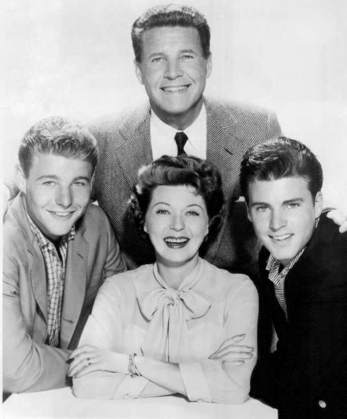
For those old enough to remember, Michael and Robby Meeropol will always be the Rosenberg boys.
I never knew them as such, but it’s not hard to imagine what they were like, in part because there are so many pictures. In one, from June 1953, they are sitting outside the White House in shirts and ties, wool coats, and Brooklyn Dodgers caps. Six-year-old Robby holds his grandmother’s hand; to his right stands a rabbi.
The boys look uncomfortable, and solemn. Their parents, Ethel and Julius, have been convicted of spying for the Soviet Union and sentenced to death. Robby and Michael are there to ask President Dwight Eisenhower to spare their lives. Michael, who is 10, has written a letter that he will hand to a White House guard: “Please let my mommy and daddy go and not let anything happen to them. If they come home Robby and I will be very happy we will thank you very much.”
Out of the frame, but documented in other photos from that day, are the placards that protesters carried invoking Robby and Michael, the helpless boys made symbols of what many believed was a grave injustice about to be perpetrated against their parents. (Counterprotesters, carrying signs saying FRY ’EM and HANG ’EM, disagreed.) Similar scenes played out around the world. After Pope Pius XII called for clemency, the Vatican’s newspaper cited the “two little innocents on whose soul and destiny the death of their parents would forever leave sinister scars.”
I learned the broad outlines of the events that followed—the electric chair, and the orphans it left behind—half a century later, on a weekend visit to the home of my parents’ friends Robby and Elli in western Massachusetts. I was 8. I don’t recall how the subject came up or exactly what I was told, but I remember trying to picture the electrocution, and that I couldn’t sleep that night. I knew Robby mostly as the kind of adult who enjoys making bad puns and funny faces for kids’ amusement. The notion that, as a kid himself, he had been orphaned by the United States government didn’t seem to match his playful persona. I wondered, but didn’t quite know how to ask, how anyone could go on living after something like that had happened. And how could he possibly seem so normal?
I later learned more: that Robby and Michael had been adopted after the executions, taken a new last name, and all but disappeared from the public eye. They went to college and graduate school, got married, had children of their own—only to reemerge as public figures in the 1970s, vowing to clear their parents’ names. From then on, they’d never really stopped talking about Ethel and Julius, or pressing the government for answers about its evidence and motivations for seeking their death. By the time I was old enough to observe their advocacy firsthand—at a public event commemorating the executions’ 50th anniversary, and later in a presentation Robby gave at my high school—I understood their basic posture to be one of resolute protest. Ethel and Julius, they maintained, had not been atomic spies. They had been scapegoated for their political allegiances, framed by prosecutors, and wrongfully killed.
This was not, I came to understand, an uncontroversial position. One year, my family’s Yom Kippur break-fast meal was very nearly derailed when my dad got into an argument with one of our guests about the Rosenbergs. Julius and Ethel, this guest insisted, were both guilty as charged, and to pretend otherwise was a pinko fantasy. The incident left me with yet more questions about my parents’ friend and the complicated historical legacy he’d inherited.
I’ve lately been able to ask Robby and Michael many of these questions directly—and to go beyond the abbreviated, textbook version of their family’s story, deep into the countless primary and secondary sources that, for nearly 75 years, have helped shape an ever-evolving debate about what, in this case, constitutes truth, and what justice really means. The facts are messier and more resistant to facile conclusions than either side of the argument might care to acknowledge. Even now, new ones continue to emerge.
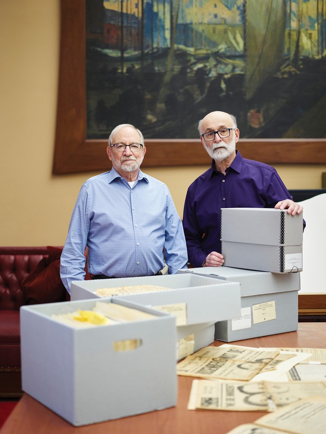
Christopher Churchill for The Atlantic; Julius and Ethel Rosenberg collection at the Howard Gotlieb Archival Research Center, Boston University Libraries
Michael ( left ) and Robby with items from the Rosenberg papers at Boston University, more than 70 years after the executions
Since the fall of the Soviet Union 35 years ago, government files have been declassified and grand-jury testimonies unsealed; key players have made dramatic confessions. Robby and Michael, the old men who were once such young boys, have had to make their own sense of these revelations. Not all of them have been easy to accept.
In April of last year, I spent a day with the brothers in Cold Spring, New York, where Michael and his late wife, Ann, moved in 2009. The town sits on a hill overlooking the Hudson River, and I got off the train from New York City that morning with hikers who fanned out to the nearby trails.
Robby was waiting to pick me up at the station in his red Toyota; he’d arrived early, as he is apt to do. On the short drive to Michael’s condo, we made easy small talk. I’d made clear that the article I was writing would be solely mine to shape, and they’d agreed that I could ask them anything. But I knew that once I turned my recorder on, I’d need to ask questions that might put me in league, in their minds, with the legions of other journalists they believed had fixated on the wrong angles, or missed the point of the Rosenberg case entirely.
Before I started reporting this story, I’d met Michael only in passing. We’d now talked on the phone a few times, and my main takeaway was that his being a retired economics professor made a lot of sense. His tendency was to carefully (and loquaciously) argue a point, and he had limitless enthusiasm for wading into the minutiae of legal details and chronology. Robby, by his own admission, preferred to focus on more general themes. As the three of us sat talking in Michael’s living room, Robby pointed out that his brother, being four years older, had spent far more time with their father than he had. Robby seemed to think of Julius more as a historical figure he happened to be related to, while Michael, on some level, still mourned the father he’d lost as a 10-year-old.
Julius was a co-owner of a struggling machine shop on the Lower East Side. On weekends, he would take Michael to ride the New York City subways and elevated trains for hours on end; they would stand at the very front, where they could look out at the switching tracks. Ethel stayed home with Robby. She worked hard at being a good mother—she sang to her boys, read Parents’ magazine, took a class in child psychology. In their small apartment near the Manhattan Bridge, the kids shared the lone bedroom while their parents slept in the living room.
Listening to Michael’s descriptions, you could almost forget that his early years were different from those of other postwar American kids: “I’d have a wooden baseball bat and a Spalding ball or a tennis ball. He”—Julius—“would pitch it to me, and I would hit it.” Michael was listening to The Lone Ranger on the radio when, one July night in 1950, FBI agents came to the door to arrest his father.
In his letters from jail and later prison, Julius tried to reassure his sons. “Don’t you worry,” he wrote; “we’ll be playing games again as soon as I can straighten out this trouble I’m in.” But on August 11, after Ethel appeared before the grand jury that had indicted Julius and refused to answer any questions, she, too, was arrested. Neither of them ever came home again.
After his mother’s arrest, Michael told an aunt that he wanted to run into the street and get killed by a car. He stopped eating. He drew endless railroad tracks, switching and merging and looping but going nowhere. When he complained to his grandmother Tessie Greenglass, with whom he and Robby were staying, she told him to send Ethel a telegram. But he didn’t want to upset his mother, so he said that he was “having a nice time. I miss you very much. Love, your son, Michael.”
The boys were eventually sent to the Hebrew Children’s Home in the Bronx, where attendants beat and ridiculed children. To Robby, it felt as if he and Michael were imprisoned, just like Ethel and Julius. He didn’t understand what his parents had been accused of doing. Instead, he harbored an anxious sense that some menacing force had broken up his family—and stood ready to do more damage if given an opening. He would try to avoid attracting attention, lest “they” take notice and wreak more havoc. He also developed a coping mechanism that I sensed had become a lifelong habit: “Whenever something was really bad,” he told me, “I always figured out some way to say, Oh, it’s no big deal. It’s not happening. It’s a form of denial, I guess.”
As I watched the brothers that day in Cold Spring, they struck me as, above all, brothers—by turns affectionate and peeved with one another, as likely to use a childhood nickname as to sigh in exasperation. They are fluent in the vigorous conversational cadence of older Jewish men raised in mid-century New York. “Verbal combat,” Robby later said, was a favored family pastime. But neither of them seemed eager to undergo much emotional probing.
At one point that afternoon, Michael spent a few minutes recounting the songs his parents had played for them as kids, enjoying himself as he quoted what Julius had called “nonsense” lyrics from “Oh! Susanna” and other “camp songs.” If not quite fully transported back in time, he appeared willing, at least, to try going there.
Without meaning to, I broke the spell. As Michael began to reflect on his relationship with Ethel, and his sense that he’d been a “bad boy,” frequently misbehaving, I tried to prompt Robby to add his own recollections from that pre-arrest period. “I don’t know,” Robby said, and paused. Maybe it was too much to expect a 3-year-old to have formed clear memories. In any case, he quickly changed the subject back to their decades of advocacy work.
Before I boarded my return train to New York City, Michael reminded me to look out the window on my left. A few stops away, in Ossining, the barbed-wire fences and high turrets of Sing Sing towered over the tracks. In opting to spend his retirement near his grandkids, Michael had ended up living half an hour from the site of his parents’ deaths.
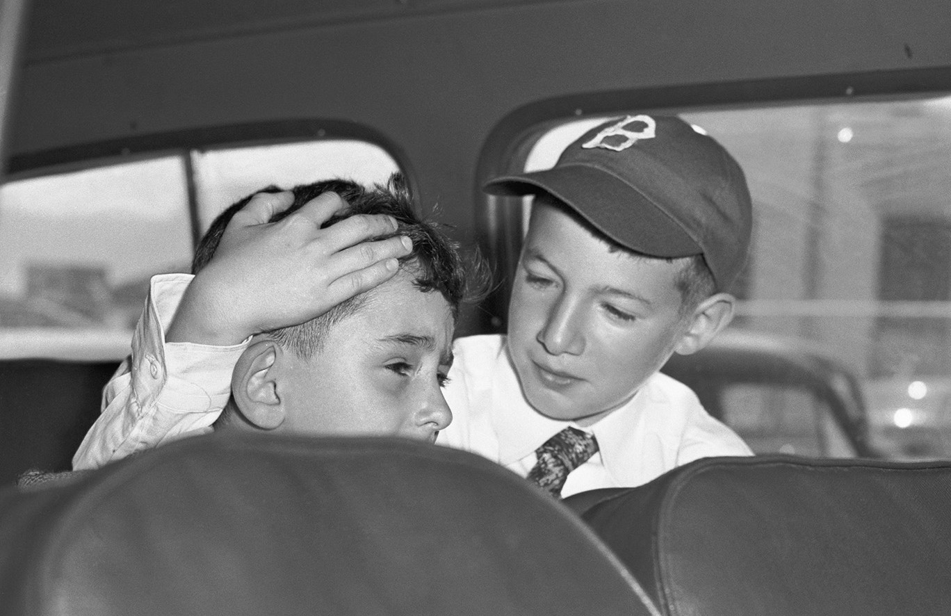
Robby and Michael visited their parents in prison for the first time in the summer of 1951, after more than a year apart. By then, the boys had gotten used to the Hebrew Children’s Home, and then they had gotten picked up from it. Now they were staying with their “Bubbie,” Sophie Rosenberg, who played with them and cooked foods they liked. Still, they were eager to see their parents again.
Julius and Ethel were separated in prison, allowed to see each other only once a week or so. Mostly, they communicated through letters. Anxious to put the boys at ease, Julius wrote to Ethel that he planned to draw them pictures of trains, boats, and buses. “Hah! You can’t make me jealous with your boats and trains,” she replied. “I have an envelope full of rare specimens collected with painstaking care by that intrepid hunter of wild insects, namely, your wife!” She worried that Robby in particular “may be a little shy and strange with us.”
In another letter to Julius, Ethel imagined how they might explain their situation to the boys. “Of course, we feel badly that we are separated from you but we also know that we are not guilty and that an injustice has been done to us by people who solved their own problems by lying about us,” she wrote. “It’s all right to feel any way you like about them, so long as your feelings don’t give you pain and make you unhappy.”
At Sing Sing, the boys saw Ethel first, then Julius. Determined to prove his fearlessness, Michael asked to see the electric chair for himself. Ethel had suggested that Julius describe its effect as “painless electrocution,” similar to “a highly magnified electric shock that anybody might sustain.”
“The fact is both children are disturbed,” Julius wrote after the visit.
Bettmann / Getty
Robby and Michael visited their parents in prison for the last time on June 16, 1953.
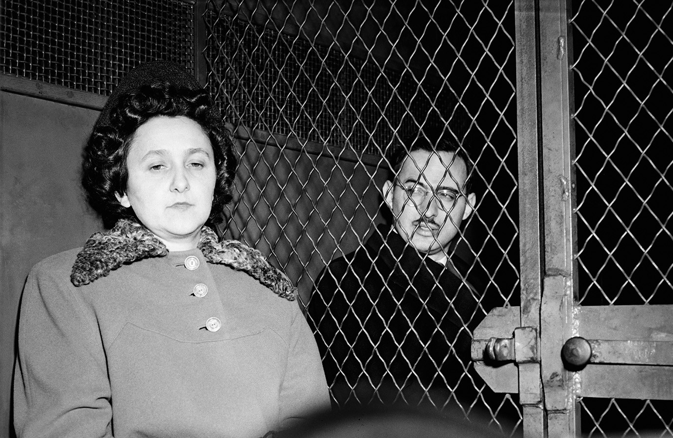
Bettmann / Getty
Ethel and Julius Rosenberg in a police van after their conviction
The executions had been set for May 1951, but the date kept getting pushed back as appeals made their way through the legal system. On subsequent visits, all four Rosenbergs were allowed to be together, and the mood of their reunions became lighter. As a family, they laughed and sang songs; sometimes, they played hangman. When Michael asked his parents if they were truly innocent, they assured him that they were.
“You boys are our greatest pleasure and joy in life and we love you more than anything else in the world,” Julius wrote in one letter. And indeed, it’s hard to read the letters, and the various accounts of these visits, and come to any conclusion other than that Ethel and Julius loved their sons. They agonized over the details of the boys’ care and cursed the government for separating them.
But it’s also hard not to question why they didn’t do more to prevent their sons from being orphaned—why they chose not to take advantage of the numerous opportunities they were given to cooperate with the authorities, and to live.
Ethel’s younger brother David Greenglass made a different choice. When Klaus Fuchs was arrested by the British in early 1950 for passing atomic plans to the Soviets, his testimony led American authorities to Harry Gold, a chemist. Gold in turn led them to David, who had been a machinist at Los Alamos during World War II, and his wife, Ruth.
The Greenglasses quickly confessed that they had been part of a spy ring led by Julius Rosenberg, through whom they said they had shared sketches of the atomic bomb’s design with the Soviets in 1945. Ruth said that Julius had told her to recruit David, and that Ethel was there and had been encouraging.
The FBI was certain that Julius had more valuable information, and hoped that he would confess and name names, just as his brother- and sister-in-law had. But Julius denied everything, and refused to point a finger at anyone else. So J. Edgar Hoover decided to adopt a recommendation from a subordinate, who wrote that agents should “consider every possible means” to make Julius talk—including bringing charges against Ethel. Hoover wrote to the attorney general: “Proceeding against his wife might serve as a lever.”
The Greenglasses’ testimony gave the government enough evidence for an arrest warrant. But like Julius, Ethel told the authorities nothing—nor did her arrest have the intended effect on her husband. The trial, though, brought out new testimony from the Greenglasses, who said that Ethel hadn’t just been a supportive bystander, but had typed up David’s hard-to-read notes on classified atomic science. Now the death penalty seemed like a real possibility for both Rosenbergs.
At the sentencing, Judge Irving R. Kaufman said that he considered the couple’s actions “worse than murder”—a crime with untold numbers of past and future victims. Russian access to the atomic bomb, Kaufman said, had “already caused, in my opinion, the Communist aggression in Korea, with the resultant casualties exceeding 50,000 and who knows but that millions more of innocent people may pay the price of your treason.” Kaufman made clear that both husband and wife were to blame. “Julius Rosenberg was the prime mover in this conspiracy,” he said, but Ethel was a “full-fledged partner.” Both therefore deserved to die.
Subsequent revelations from multiple prosecutors in the case have shown that the judge didn’t come to this conclusion entirely on his own. Roy Cohn, who was an assistant U.S. attorney on the case, later said that prosecutors had had clandestine phone conversations with Kaufman, “especially about whether Ethel should be sentenced to death.”
The Rosenbergs’ co-defendant, Morton Sobell, a former classmate of Julius’s at City College, also claimed total innocence. Sobell was convicted of conspiracy to commit espionage and sentenced to 30 years in prison (he was spared the death penalty because no evidence tied him to sharing atomic secrets). David was sentenced to 15 years in prison and served less than 10. Ruth, who was never charged, stayed with their two young children.
A few weeks before their deaths, the Rosenbergs were visited at Sing Sing by James V. Bennett, the director of the Bureau of Prisons. Bennett said he’d been sent by the attorney general with an offer: If they were ready to talk, officials would recommend clemency.
Ethel was outraged. “I made it short and sweet,” she wrote to her lawyer. “I was innocent, my husband was innocent, and neither of us knew anything about espionage.” What right did the government have “to try to forcibly wring from us a false confession, by dangling our lives before us like bait before hapless fish! Pay the price we demand, or forfeit your lives, is that the idea?” Bennett pleaded with her to change her mind.
The deputy attorney general later said of Ethel, “She called our bluff.”
In June 1953, the day after their 14th wedding anniversary, after several last-minute appeals—including to the U.S. Supreme Court—had failed, Julius and Ethel Rosenberg, ages 35 and 37, had one final afternoon together, separated by wire mesh. Ethel wrote a letter to their sons that they would both sign: “We wish we might have had the tremendous joy and gratification of living our lives out with you,” it said. “Always remember that we were innocent and could not wrong our conscience. We press you close and kiss you with all our strength.”
The letter would have a much wider audience than just Robby and Michael, who were by then living with family friends in New Jersey. The uncertain fate of the Rosenbergs had become global news, and the couple’s letters were being distributed in dozens of countries via pamphlets and newspapers. From December 1952 to June 1953, 80 rallies in support of the Rosenbergs were held in Paris alone. One French diplomat told Secretary of State John Foster Dulles that the case was “the most troublesome issue affecting relations between the United States and Europe.”
Christopher Churchill for The Atlantic
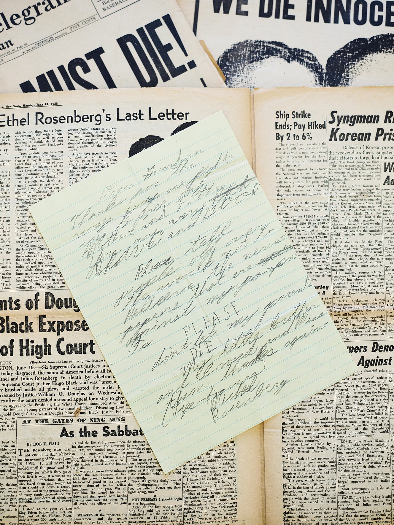
“PLEASE don’t let my parents DIE. My little Brother and I need and miss them,” Michael wrote in a letter to a left-wing weekly.
Last summer, Robby, Michael, and I visited the archives at Boston University’s library, where many of their parents’ prison letters are housed. As we looked through the collection, Michael said that, when it comes to his mother’s letters, he considers only two or three “really real”—that is, not written for public consumption. He has returned to one of these often.
Two days before the scheduled executions, Robby and Michael visited their parents for the last time. Michael left crying and screaming: “One more day to live, one more day to live!” But Ethel didn’t cry. Later, she tried to explain her behavior in a note she sent her sons via her lawyer. To show emotion “would have been so easy, far too easy on myself,” she told them. “I took the hard way instead of the easy, because I love you more than myself and because I knew you needed that love far more than I needed the relief of crying.” She continued:
I know, sweethearts, an explanation of this kind cannot ever substitute for what we have been missing and for what we hope to be able to return to, nor do I intend it as any such thing. Only, as I say, we need to try to remain calm and free from panic so that we can do all we can to help one another to see this thing through!
Just after 8 p.m. on June 19, Julius followed Sing Sing’s Jewish chaplain to the electric chair. As the rabbi prayed, the executioner secured the five leather straps. Before he delivered the fatal shocks, he put a leather face mask on Julius meant to prevent his eyes from popping out of his head. Julius was pronounced dead after he received three charges of electricity.
The rabbi then gave Ethel a final chance to live. Did she have any names to share? She said she did not: “I’m innocent; I’m prepared to die.” She was strapped in and masked. The executioner delivered three shocks. But doctors found that the three charges had not been sufficient; Ethel’s heart was still beating. It took two more jolts, and four and a half minutes total, to kill her.
Michael and Robby were watching a baseball game on TV when a news flash came on the screen announcing that their parents were about to be executed. The adults sent the boys out to play ball with friends. By the time they came back in, they were orphans.
I first read Robby’s memoir, An Execution in the Family, soon after it was published, in 2004. I was 11 then, and gripped by the kid’s-eye perspective of the early chapters. I retained two distinct mental images from the book. One was of the Hebrew Children’s Home. The other was of a train set, which served as a partial answer to the question of how the boys could have turned out as well-adjusted as they had; there was, strange as it sounds, a happy part of this story.
On Christmas Eve 1953, the boys went to a party at the home of W. E. B. Du Bois, who had advocated for clemency for Ethel and Julius. Inside the largest house the boys had ever been in was an enormous Christmas tree with a pile of presents underneath it, all for them. This was where Michael and Robby first met Anne and Abel Meeropol, who asked them that night if they wanted to move in with them. Their own two sons had been stillborn, and Anne and Abel, now in their 40s, wanted badly to be parents.
By the start of 1954, Robby and Michael were living with the Meeropols in Manhattan; the couple were fun and loving, and the boys quickly began calling them Mommy and Daddy. But one night in mid-February, after Robby had gone to sleep, New York City police officers knocked on the door of the couple’s apartment to demand that he and Michael be turned over immediately.
Ethel and Julius’s lawyer had died of a heart attack before he could legally transfer guardianship to the Meeropols. Now two child-welfare groups had obtained a court order to remove Michael and Robby from the Meeropols’ home, on the grounds that living with former Communist Party members was not in the boys’ best interest. Abel refused to open the door and, in Michael’s telling, informed the officers that, if they wanted to take Robby and Michael, they’d have to kill him first. Somehow, he and Anne were able to arrange with lawyers to keep the boys overnight.
The next day, a judge ruled that Robby and Michael should be considered wards of the state and sent them to an orphanage. But the day after that, the Meeropols and Sophie Rosenberg, the boys’ grandmother, appealed to the New York Supreme Court, which gave Sophie temporary custody. For the next several months, Robby lived in fear of being sent back to the orphanage. Eventually, in September 1954, he and Michael were allowed to return to the Meeropols’. Recounting this turning point as we pored over the archives at Boston University, Michael began to cry. Anne later told him, he said, that she and Abel had plans to flee to the Soviet Union with the boys if they were not granted custody.
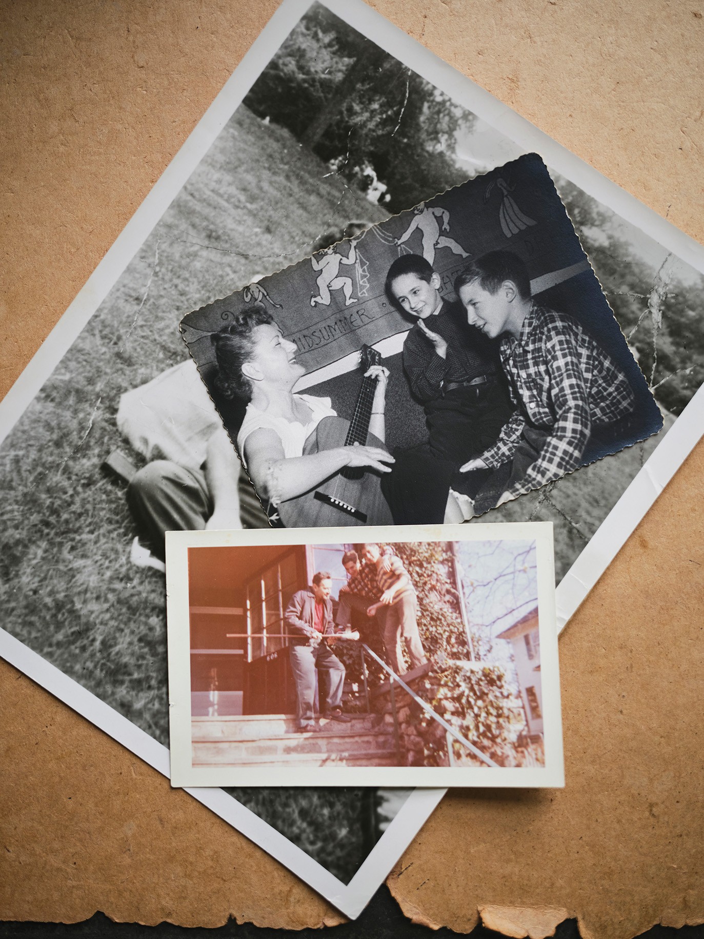
Michael and Robby started using the Meeropol name almost immediately, allowing them at last to slip back into private life, and they were formally adopted in 1957. The family’s Washington Heights apartment was, as Michael and Robby remember it, always full of laughter, music, and funny voices; it had room for all of their toys, including a Lionel electric train set. The boys kept huge tanks of fish and had a cat named Fuzzy Shnooky Romeo. When Robby went away to camp, Abel drew him cartoon postcards with silly, smiling animals. “Daddy got us worms!” the fish exclaim in one. “Yum! Yum! Hooray!” Abel signed the postcards “Pop.” Robby still has them.
Christopher Churchill for The Atlantic; courtesy of the Meeropol family
In 1954, Robby and Michael went to live in Manhattan with Anne and Abel Meeropol, who later became their adoptive parents.
Both Abel and Anne had been public-school teachers; Abel had taught James Baldwin high-school English. Abel was also a songwriter—in the 1930s, he’d written the music and lyrics to “Strange Fruit,” a song about lynching made popular by Billie Holiday—and had been successful enough that the couple could now live primarily off his royalties, in effect serving as full-time parents.
Anne and Abel rarely brought up the past with Michael and Robby, but when Ethel and Julius did come up, the Meeropols reinforced their sons’ impression of them as brave, principled people who had been wrongly executed. As they grew into adulthood, Michael and Robby came to treat that final letter from June 1953 as gospel: Always remember that we were innocent and could not wrong our conscience.
In the years immediately following his parents’ executions, Michael said, he didn’t cry at all. But when he was 16, a work of fiction—a 1947 novel by Willard Motley—finally cracked the defensive shell he’d developed. In his journal, he wrote:
I read the end of Knock on Any Door which describes a man’s feelings as he goes to his death in the chair. It shook me, and it broke me. I realized that the two dearest people in the world to me had gone through that agony and more. They probably worried about their “babies” and what would happen to them. My God was it awful. I cried and cried and cried so much. I feel terrible.
Oh to be half as courageous as those two wonderful people—Ethel and Julius Rosenberg. MY GOD
Abel saw him crying, and saw what he’d been reading, and gave him a long hug.
More than their childhood, Robby and Michael wanted to talk with me about the chapter of their lives that began in the 1970s, when they chose to “come out” as Rosenbergs after years of keeping quiet about who they were.
One night in early 1973, Michael heard that a trial lawyer named Louis Nizer, who had not been involved in the Rosenberg case, was reading out loud from his parents’ prison letters on TV. Nizer had just published a popular book about the case, The Implosion Conspiracy, which concluded that the Rosenbergs were guilty as charged. Michael called Robby, upset. The brothers believed that they held the copyright to their parents’ letters, which they saw as their sole inheritance. Why should Nizer be allowed to use them for his own biased ends?
On June 19, 1973, the 20th anniversary of their parents’ deaths, they filed a lawsuit. “We are strongly reaffirming our identification with and respect for our murdered parents and what they did for us both in their role as citizens as well as in their relationship with us as parents,” they wrote. It wasn’t long before the press showed up. “All of a sudden we were public,” Robby recalled. “And the sky didn’t fall.” In some ways, it was liberating to no longer be keeping such a big secret.
The legal bills were expensive, and they began traveling around the country to raise money, giving speeches under the auspices of a new National Committee to Reopen the Rosenberg Case. They planned to use the Freedom of Information Act to obtain the government’s evidence, or lack thereof, about their parents. In 1974, Robby stood onstage at Carnegie Hall and declared, “In the next year we are going to blow the lid on this case.”
Touring the country, they met well-wishers who were emotional about seeing “the boys” as grown men, people who cried and hugged them and hung around a little too long. Robby and Michael found this draining. Their preferred approach relied more on logic than emotion. They vowed to follow the facts. They would become experts; they would make an unimpeachable case. They wouldn’t get carried away by anger or grief.
Still, revisiting the letters and reading the trial transcripts for the first time forced Michael to relive the pain of his parents’ deaths, he told me. Publicly, he remained composed, but in private, for a year or so, he “cried, cursed, raged,” struck anew by the pathos of his parents’ correspondence and the could-have-beens of their complex appeals process. By the late 1970s, the brothers were exhausted by the work of being professional Rosenbergs, and starting to worry that the effort was futile. Their FOIA lawsuit had yielded hundreds of thousands of documents, but there was no smoking gun—maybe there never would be.
Sometimes, Robby and Michael told me, they wondered if there might be more to their parents’ story than what was in their letters. They never questioned that Ethel and Julius had been framed as atomic spies, but could they have committed some lesser offense that had made them government targets? Yet whenever the brothers asked Morton Sobell, their parents’ co-defendant, to tell them the truth, all they got was the same one-line answer: They were innocent.
With the collapse of the Soviet Union, rumors started trickling out of Russia: According to erstwhile KGB agents now speaking openly for the first time, Julius Rosenberg had in fact been a spy, and a valuable one. But Soviet intelligence operatives aren’t anyone’s idea of reliable sources, and it was easy for Robby and Michael to brush their claims aside.
In July 1995, the U.S. government released a series of previously classified documents known as the Venona files. These decrypted Soviet communications from the 1940s told a similar story to that of the former KGB agents: Julius, along with Ruth and David Greenglass, had spied for the Soviet Union. The headlines crowed with the certainty of a fresh verdict: “NEW EVIDENCE PROVES COUPLE WERE SPIES, OFFICIALS SAY.”
To Robby and Michael, suddenly seeing their parents in the news again as spies was painful. The whole thing felt like a disaster—“like a ton of bricks,” as Robby put it to me. In a joint statement, they suggested that the NSA and the CIA had “cooked” the evidence to frame their parents. Venona, they insisted, changed none of their conclusions. One official release was not going to be enough to undo years of deep suspicion of the government.
Still, Robby and Michael parsed the new evidence carefully. The files, they noticed, contained only one mention of Ethel: She was politically aligned with her husband and aware of his activities, the decrypted text said, but “in view of delicate health does not work.” This seemed like an important clue. If you interpreted “work” to mean “spy,” as Robby and Michael did, that would suggest the damning typing story was pure invention on the Greenglasses’ part.
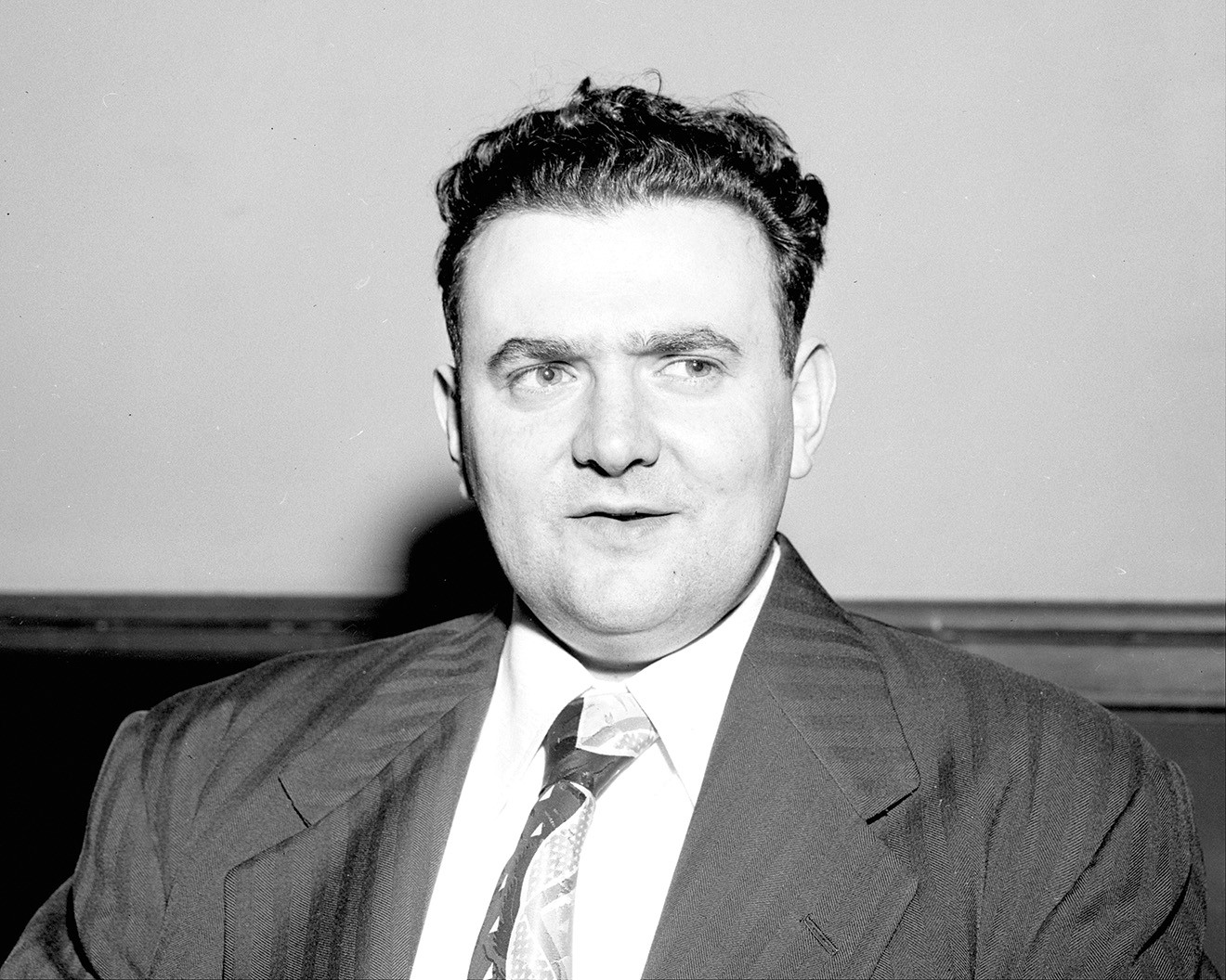
Ruth Morgan / New York Daily News Archive / Getty
Ethel’s brother David Greenglass told authorities that he had been part of a spy ring led by Julius Rosenberg.
Slowly, more clues emerged. In 1999, a former KGB agent published a book revealing findings from Soviet archives that had briefly been opened a few years earlier. This, too, implicated Julius as a spy. Then, in a 2001 TV interview, David Greenglass (who had been living under an assumed name since he got out of prison and appeared on the program in disguise) admitted that he’d lied on the stand when he said that Ethel had typed his notes. “I don’t know who typed it, frankly,” he said. “To this day, I can’t even remember that the typing took place.”
Greenglass did not express remorse for having sent his sister to her death, citing her “stupidity” for not cooperating with authorities. He said his conscience was clean. When the interviewer asked him what he would say to Robby and Michael, whom he had not seen since they were children, he replied, “I’m sorry that your parents are dead.”
Morton Sobell was the one person who could definitively answer Robby and Michael’s questions about their parents. He had been Julius’s friend since they’d met as engineering students at City College. He had stood trial with both Rosenbergs and, after getting out of prison in 1969, stayed in touch with Robby and Michael.
For nearly six decades, Sobell maintained his innocence. But in 2008, at the age of 91, he told a reporter that, yes, he and Julius had turned over military secrets to the Soviet Union during World War II. If you wanted to call that spying, then sure, they’d been spies. Ethel, he said, had known what Julius was doing. “But what was she guilty of? Of being Julius’s wife.” Robby and Michael felt as though, for the first time, a trusted source had stated it plainly: Julius was a spy, and Ethel was not.
The brothers were shocked by Sobell’s sudden admission. They had asked him again and again to tell them the truth about their parents, even if only in private. Why had he lied? Michael still thinks about this, he said: “What if Morty had been honest with us?” He could have spared them so many years of uncertainty.
Even so, the brothers told me that finally learning the truth was a relief. They were in their 60s by then—both grandfathers—and had had more than a decade to consider the information in Venona. They now understood that their parents’ prosecution hadn’t been a senseless witch hunt, as they’d once believed. Ethel and Julius hadn’t been targeted randomly, or simply for having been Jewish Communists during the McCarthy era. And because Sobell himself had been the one to say it publicly, Robby and Michael wouldn’t have to do the uncomfortable job of breaking the news to the remaining Rosenberg true believers, who still thought that any talk of spying was a government hoax.
I was taken aback by their matter-of-factness. Was that really it? Could their ultimate reaction to learning that Julius had spied for the Soviet Union have been gratitude that they didn’t have to be the messengers? I wanted to know how they felt about the actual spying—about the fact that their father had shared highly classified information in order to aid another, later hostile, country’s militarization, destroying their family in the process.
When I pressed them on this, Michael and Robby conceded that perhaps Julius had been, as Robby put it, “kind of a cowboy,” prone to taking big risks without much concern for the effect they might have. Maybe, Michael suggested, a more responsible choice for a spy would have been to not have children at all. Nonetheless, they both remain sympathetic toward their father, and continue to argue that he was unfairly prosecuted. Even if Julius was a spy, they maintain, he was not an atomic spy, and as such was not guilty of the charges for which he was executed.
Julius seems to have approached his spying with a sprightly, if naive, enthusiasm. He was 24 and working as a junior engineer for the Army Signal Corps in New York when he was recruited by Russian agents in 1942, drawn to the promise of helping defeat Hitler and the notion, however fanciful, that the Soviet Union represented a solution to America’s social ills. He went on to provide thousands of documents containing valuable military-industrial information, and became an active recruiter. His Soviet handler Alexander Feklisov recalled in his memoir that Julius could sometimes “be as carefree as a teenager,” such as when he greeted the Russian during an early street-corner meeting with a hearty “Hello comrade!” On another occasion, Feklisov wrote, Julius told him that, although he loved his wife and son (this was before Robby was born), his meetings with Feklisov were “among the happiest moments of my life.”
Unlike Julius, Ethel was never given a code name in Venona, which Michael and Robby took to mean that she was not a spy. Why, then, should she have sacrificed herself, leaving her sons behind, particularly after Julius was executed and she was given one last chance to cooperate? Why did she choose death?
The question nagged at me for months; no single explanation—psychological, political, or otherwise—felt completely satisfying. Part of me wanted to see Ethel as a victim, caught between her husband’s recklessness, the vindictiveness of powerful men who didn’t care whether she lived or died, and the fear that she was already too far down a path of deception to allow the world, let alone her sons, to learn the messy truth. I thought about the toll that years of what was essentially solitary confinement, as the only woman on death row, would take on anyone; it seemed likely that she was not, by the end, thinking rationally. But that way of looking at it denied Ethel agency. It was possible, of course, that she’d made the choice to die of her own free will—as a martyr for the Communist cause, to make the United States look bad, out of loyalty to Julius.
When I raised the subject with Robby and Michael, they readily agreed that Ethel could have saved herself, had she wanted to. “She did have names,” Robby said. “In fact, if she’d given the names of Sarant and Barr”—Alfred Sarant and Joel Barr, members of the spy ring who had already defected to the Soviet Union—“nothing would have happened.”
“So should she have?” I asked.
Both brothers replied immediately and emphatically. “Oh no,” Michael said. “I don’t see why,” Robby added. Making any choice other than the one she ultimately made, they argued, would have left Ethel with a permanent sense of guilt over turning on her husband and reversing her steadfast commitment to “see this thing through”—the battle she’d been waging, and the story of innocence she’d been telling her sons and the world for three years.
“Mom could’ve said, I knew Julius was a spy; I helped him a little bit. I knew the names of two of the people he worked with. That’s all I know; take it or leave it,” Michael said. “They would’ve taken it.”
“Who knows,” Robby muttered, but Michael’s counterfactual scenario seemed plausible enough to me, and I let him keep talking as he imagined what might have happened next.
“She would have served some time in prison, and repudiated her marriage, and repudiated all the people who had supported them, and pulled the rug out from under Rob and me when they said that ‘we were innocent.’ And then shown up in our lives.”
I knew he was trying to explain why this never would have worked. But even if their mother reappearing in their lives at a later date might have proved complicated, it was hard for me to believe that it would truly have been worse than not having her in their lives at all. “We might have grown up to hate her,” Michael continued. He wasn’t sure he could have forgiven her for turning on his father—or for exposing the reality, while she was still alive, that both parents had lied to their sons. “The thought of her living that life was so horrible that I think it was easier to just follow him into the grave.”
Michael seemed to be saying that by admitting her dishonesty, Ethel would have ruined their childhood and poisoned any prospect of a future relationship with her. But wouldn’t some people see the fact that she’d died for a story she knew was false—something the brothers were acknowledging—as a greater betrayal? Michael and Robby didn’t seem willing to think about it that way. In their telling, Ethel had died, at least in part, to protect them.
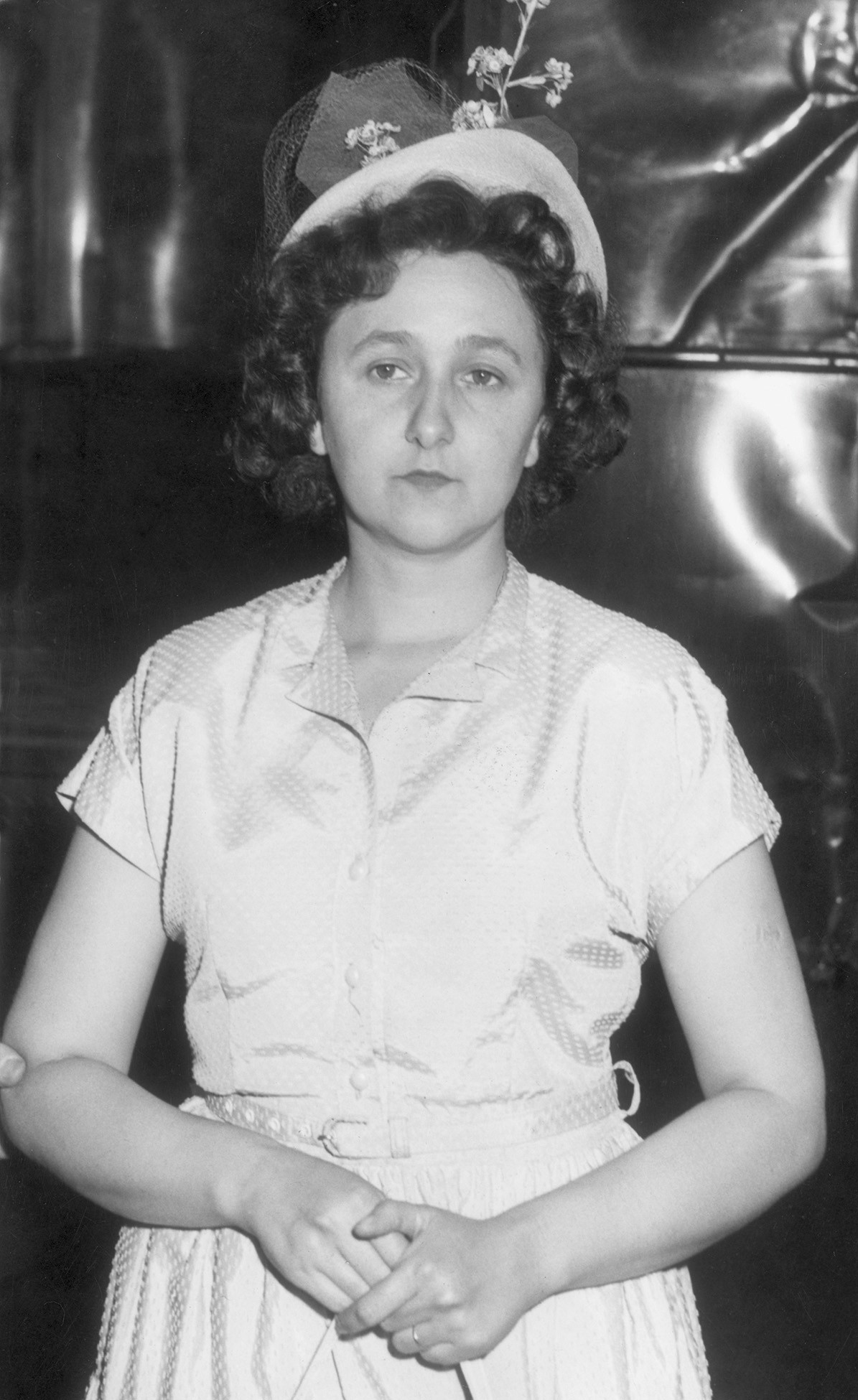
Hulton Archive / Getty
Ethel at her arraignment in August 1950
For the brothers to wish for any other outcome would be for them to wish for an entirely different life than the one they’ve had and, against all odds, mostly enjoyed. It would be to wish that they’d had a childhood with no Meeropols, and an adulthood with more secrecy, less purpose. Faced with something—someone—so ultimately unknowable, perhaps the best that anyone can do is decide on their own version of the truth and stick to it.
I am not, I realize, the first to raise these contradictions. The ghost of Ethel Rosenberg has haunted American life for decades, by turns exasperating and enthralling those—psychiatrists, playwrights, novelists, scholars, journalists, relatives—who have tried to wrap their arms around the meaning of her life and death.
Few today would dispute that the government’s case against Ethel was less than airtight. In 2015, after David Greenglass died, his 1950 grand-jury testimony was unsealed. “I said before, and say it again, honestly, this is a fact: I never spoke to my sister about this at all,” Greenglass had said. If that was true, then he had likely perjured himself when later, at trial, he gave the evidence that led to Ethel’s conviction and sentencing. To some, Ethel’s alleged encouragement of David’s recruitment is evidence enough of her active role in the conspiracy to commit espionage of which she was found guilty. But Robby and Michael argue that knowledge of a conspiracy is not the same as participation in it—and that the prosecution failed to produce any proof she did participate, beyond what came directly from the Greenglasses’ unreliable accounts.
Whether or not you believe that the Rosenbergs deserved to die, there’s no denying that the punishment they received was unusually severe. Harry Gold was convicted of conspiracy to commit espionage and got out of prison in time to work as a clinical chemist in a Philadelphia pathology lab before he died at 60. Ruth Greenglass confessed to being a courier at Los Alamos and never spent a single night in jail. And, indeed, the case against Ethel was especially thin.
All of this ought, I think, to count for something in any honest assessment of the legal and ethical validity of the Rosenberg verdict. But I wasn’t sure that the injustice of the whole affair was enough to explain, logically or morally, the clarion confidence of Ethel’s claim that “I was innocent, my husband was innocent, and neither of us knew anything about espionage.” That was a lie.
Last summer, I visited Robby in western Massachusetts, where we sat in his sunny home office as his elderly gray cat threatened to knock over our water glasses. On the wall next to Robby’s desk, I noticed a calendar from the Union of Concerned Scientists. The cartoon for that month showed a uniformed military official lounging coquettishly on a bed, phone in hand. The caption read: “No, you dismantle your nuclear arsenal first.”
Other walls displayed framed mementos from the Rosenberg Fund for Children, the nonprofit Robby started in 1990 that supports the children of progressive activists who have lost their livelihood, been discriminated against, faced prison time, or died as a result of their activism (my parents have been longtime supporters of the RFC). Pointing to the images in his office, Robby told me that the organization has allowed him to connect with hundreds of kids and teenagers who can relate to what he experienced. They have sometimes asked why he’s not angrier. His response has always been that he considers his work to be a form of “constructive revenge.”
“My taste in vengeance is more intellectual than physical,” Michael wrote in the ’80s. Talking with him in the 2020s, I could see what he meant. Rather than cause for frustration, it seemed to be almost a source of comfort that there will always be another thread in the Rosenberg case to pull—more documents to uncover, more verbal combat to undertake.
Over the past decade, Robby and Michael have made a concerted push for Ethel’s exoneration. In December 2016, the brothers again stood outside the White House, this time to deliver a petition asking President Obama to exonerate their mother in light of the newly released grand-jury testimony. They held a photograph of themselves there as boys, delivering the plea to Eisenhower that went unanswered. This one did, too.
But a newly declassified document released toward the end of Joe Biden’s presidency once again gave them hope. In September 2024, the brothers received a copy, via their lawyer, of a handwritten 1950 memo by Meredith Gardner, the chief Venona code breaker. If the Venona files represented Gardner’s translated decryptions of the original Russian messages, this document, they believed, showed his own takeaways from those decryptions, and were thus a better reflection of the U.S. government’s top-level findings. Gardner wrote, for example, that Ruth Greenglass was known “to have been a Soviet agent.” Just below that are his notes on Ethel:
MRS. JULIUS ROSENBERG—A message of 27 November 1944 stated that Mrs. Rosenberg was a party member, a devoted wife, and that she knew about her husbands work, but that due to ill health she did not engage in the work herself.
Unlike the earlier releases, which stated only that Ethel did not work, this one specified that she did not engage in the work—the spying.
To Michael and Robby, this was the smoking gun that they had spent 50 years hoping to find. The first time they read the memo, they told me, they high-fived; Michael cried. They called on the Biden administration to exonerate their mother. Again, they were disappointed.
One virtue of Julius and Ethel having been dead for nearly three-quarters of a century is that their sons will never have to confront them about what they now know; one difficulty is that they will never get to. This impossibility seems to act as a kind of buffer. They can shake their heads at their father’s actions and tell themselves that their mother did the only thing she could, while reserving their deepest outrage for the one actor they still have the power to wrangle with: the United States government.
On several occasions over the course of my reporting, Michael brought up the petition that he and Robby had tried to deliver to Obama in 2016. Still eager for a reply, Michael sent a letter to the Obama Foundation in Chicago in the spring of 2025, and then another—by certified mail—to the foundation’s office in Washington, D.C. He never heard back.
Recently, Michael told me that he had given up on trying to elicit a response from the former president. “I thought it was a bigger deal than other people did,” he admitted. Robby, for his part, told me he preferred to look forward, not back. He is 79 now; his brother is 83.
But Robby didn’t mean that he was ready to stop thinking about his parents’ deaths or fighting for his mother’s exoneration—only that he didn’t want to waste any more time on old strategies that hadn’t panned out. The brothers are working with Representative Jim McGovern, Robby’s congressman, who last year made a floor speech in the House about Ethel and has advocated for her exoneration. They’d love to see a major Hollywood movie about their mother, they said, to reignite public interest in the case.
Listening to them, I thought about the train tracks Michael had drawn as a kid, endlessly looping back on themselves. Where, if anywhere, might these latest efforts lead? In some ways, the brothers have gotten much further in their quest than they ever anticipated they would; their deep satisfaction at the 2024 release of the Gardner memo came not just from its contents, but also from the somewhat improbable fact that they lived to see it, after 50 years of requests and lawsuits and petitions. It had given them a sense of forward motion, and a measure of vindication late in their lives. They knew far more than they once had. How could they stop now?
This article appears in the August 2026 print edition with the headline “The Rosenberg Boys.”
Back in February, Trump FCC Boss Brendan Carr launched a fake “investigation” of ABC because the network’s comedians and daytime talk show hosts hadn’t adequately kissed Republican ass.
“Since then, the ABC talk show hasn’t featured a single political candidate running in a competitive midterm race, according to a Semafor analysis.”
Earlier in the year, Republicans were upset that The View hosted Texas Democratic hopeful James Talarico. That triggered an entire fake “investigation” and a threatened revocation of ABC’s broadcast licenses by Carr, who falsely claimed that the daytime talk show had violated the FCC’s dated and irrelevant “equal time” rule requiring that TV stations give equal time to political candidates from both parties.
The threat of annoying costly legal headaches were still apparently enough to scare ABC (and likely other outlets) away from hosting politicians who would be critical of Trump.
It’s a shame that ABC, which had previously started to show some a signs of life in its battle with the thin-skinned U.S. president, suddenly doesn’t really want to talk about why The View rejected requests to host NYC Mayor Zohran Mamdani, or the democratic socialist candidates he supported for Congress, Darializa Avila Chevalier and Claire Valdez:
“A spokesperson declined to provide Semafor with a comment about how the show was reacting to the inquiry but has previously said the show is a “bona fide news program” and therefore isn’t subject to the equal time rule.”
Carr, you’ll recall, also threatened San Francisco area AM radio station KCBSlate last year simply for reporting on local ICE activity, resulting in the station demoting one anchor and softening its political coverage overall. Carr also tried (and failed) to censor and fire comedian Jimmy Kimmel after the late night host made a joke about deceased right wing propagandist and racist Charlie Kirk.
That said, avoiding politics entirely for fear of losing money is fairly common across corporate media (including outlets like Semafor), resulting in no shortage of pseudo-journalism that pulls its punches, particularly when it comes to being honest about the continued Republican descent into bigotry and fascism.
President Trump and Congress are neither investing in long-term solutions nor offering short-term relief. If they paid attention to different indicators of Americans’ financial health, beyond top-line growth and other traditional measures of economic success, they might feel more urgency.
So we developed one: a model budget for a family of two parents and two children under 8. We set their annual income at $130,000 — well above the roughly $83,500 national median for all U.S. households, and right in the middle of the income distribution for a family of four.
According to our calculations, the math has stopped adding up for this family over the past 18 months. They had a small cushion in 2024. Now they are in the red after covering just the basics, such as housing, an Affordable Care Act marketplace health care plan and day care. The family has over $1,000 less than it did a year and a half ago. Rising costs have more than wiped out any gains from higher wages and recent tax cuts.
This family would have trouble paying for anything beyond the basics — say, a car breaking down or a kid breaking an arm. It could not budget for any of the things that a typical family might hope for: buying a new car, taking a summer vacation or welcoming a third child.
To mount an effective response, it helps to know what stresses Americans feel most sharply and what action they expect from their elected officials. So we asked people.
By almost four to one, Americans told us that rising prices, rather than paychecks that haven’t kept up, are driving a cost-of-living squeeze. Two-thirds say they are struggling today and need relief they can feel right away. And the most cited concern is grocery costs. Some 35 percent of Americans in our survey, which we conducted last month, identified food as the single biggest source of financial pressure — approximately 15 percentage points higher than the share who named housing, the second-most-chosen option.
Several things are going on here:
First, kids, and in particular small children, are incredibly expensive in this country, because the Bible says that it’s wrong to take money from the rich to help pay the child care costs of ordinary people.
Only slightly less facetiously, I read a piece somewhere recently in which a partner at a big law firm told a woman associate that he considered choosing to have a child like choosing to go on a round the world sailing trip, that is, an act of extraordinarily extravagant consumption. It’s a real mystery why birth rates are now well below replacement level in any country where women have any economic and social freedom.
Second, it’s really hard psychologically to adjust for inflation, especially for older people as I know from experience. $130,000 per year sounds like a really big income to me because 30 years ago it WAS a really big income (equivalent to $282,000 today). But now it’s only the median income for families of four. We’ve discussed the psychology of inflation quite a bit at LGM, and it’s a difficult political issue for all sorts of reasons.
Third, a bunch of expenses that are very heavily subsidized or socialized altogether in the developed world — child care especially, but also health care and higher education — aren’t in the US, because of the Bible and Confederate Jesus and Elon Musk.
Fourth, and related, even people with moderate to quite high incomes in the US are laboring under the constant and growing pressures of economic precarity, because of the Bible etc.
Fifth, housing costs vary wildly across the country, so $130K per year for a family with two young kids might be plenty of money in Ashtabula, but barely middle class in Pasadena (of course you’re living in Pasadena rather than Ashtabula but this is in many cases not really anything like an actual choice given where the jobs that pay that kind of money are).
Sixth, the Bible.
There’s also some interesting discussion in the piece about how the price of meat in particular is a huge burden for many people, which is a problem that has at least a superficially obvious solution, but I’m pretty sure the right to bear cheeseburgers is somewhere in the Constitution so maybe not.
In an extremely odd case, a single 79-year-old patient was granted early access to Eli Lilly's powerful, still-experimental obesity drug retatrutide through the Food and Drug Administration's "compassionate use" program—raising immediate questions if that sole patient is President Donald Trump, according to a report by Stat News.
Lilly's retatrutide is a highly anticipated next-generation obesity drug that targets GIP and glucagon hormones in addition to GLP-1. It is currently in late-stage trials to treat obesity, diabetes, sleep apnea, and other conditions. Data from a Phase 3 trial that Lilly released in May indicates that patients with obesity (but without diabetes) who took the drug for 80 weeks lost 28 percent of their weight, an amount comparable to bariatric surgery.
Millions of Americans with obesity are eager to get the drug, with options being limited so far to enrolling in a clinical trial or trying to obtain it by dodgy methods.
When Google offered me the job of Director of Android Platform Security in 2017, it was impossible to refuse. Yes, Trump was already president—my family and I had qualms—but he seemed contained, even ineffective. More importantly, Google was a different company 9 years ago. Android was open source first and had just surpassed 2 billion users. I’d been studying its security from the outside since 2009, and it was (and still is!) the most exciting end-user facing operating system to work on. However, while the source code was always public, getting direct contact to the internal Android team had been incredibly difficult; trying to discuss new ideas for security mitigations or architectures supporting upcoming fields like mobile digital ID was a frustrating exercise for academics and industry researchers outside Google.
Getting the chance to lead on the inside, on the most widely used Linux based, (mostly) open source operating system in the world, was an incredible chance. I am still thankful for the initial offer, especially to Dave Kleidermacher and Nick Kralevich for their trust in me, and the welcoming atmosphere from day one. Google was the place to be to getting things done on a global scale, The culture was transparent and open to diverse discourse, and from the start it was made clear that, as Googlers, we were not only welcome but expected to bring our own identity and values into the job. As an academic and tenured professor of computer security, working on Android inside Google was literally the most appealing place in the whole of the Silicon Valley – the one that best matched the spirit of academia and my own ethical principles to work for the public good.
While I was never really involved with the cloud side of things, on the company level, the goal was still to become completely carbon-neutral, and contracts with the Pentagon were canceled after employees spoke up against them (I signed the 2018 open letter). The AI principles published by Sundar Pichai in 2018 stated very clearly that “AI applications we will not pursue: … 2. Weapons or other technologies whose principal purpose or implementation is to cause or directly facilitate injury to people. 3. Technologies that gather or use information for surveillance violating internationally accepted norms. 4. Technologies whose purpose contravenes widely accepted principles of international law and human rights.” Many computer scientists and software engineers wanted to work at Google, and I heard both hearty congrats and fierce jealousy when I mentioned the job offer to colleagues before relocating to Mountain View.
Then there were the people. Larry and Sergey were still answering some tough leadership questions every week, and “Don’t Be Evil” wasn’t just a slogan of often-referenced Googliness—it was a north star for teams making hard calls. My immediate team—Android Security, the defenders of Billions of users—has the motto to “make things so secure that we ourselves can’t break them, whether the device costs $1000 or $100, or the user is a celebrity or a refugee“. It was always about doing right for our users, and protecting their interests first (occasionally even against business interests of other Google apps and services). I met the most amazing experts within my first months of joining, including Android legends like DianneHackborn. Everybody was friendly, happy to give time to newcomers, to share their knowledge about the technology as well as about the internal processes. And everybody was dedicated to do right by the global population—thanks a lot to all of you for that hard work! I am still incredibly proud of many of our achievements, most of which required moving other ecosystem stakeholders over long periods of time. Making full device encryption the Android 10 default even for the cheapest of devices moved the world forward. Enabling end-to-end encrypted Android backup quietly while the discussions focused on Apple defined a de facto state of the art that still holds strong in current law enforcement vs. user privacy discussions. Insider Attack Resistance, ARM MTE, privacy-firstdigital credentials, and many other things were only possible because we pulled together to make our users more secure—including against a potentially malicious sub-part of Google itself.
On the one hand, this decision has been incredibly hard to make. I will miss the people, all of you who are still trying to do good for the rest of the planet. I will miss the opportunities to affect positive change. I will miss the brilliant engineers and technically focused decision-making. I will miss the blameless post-mortems and the overall, very mature culture on dealing with failures.
On the other hand, this decision has been easy because it has become unavoidable. I am a pacifist, and have long ago decided that I will not personally work for militaries engaging in offensive warfare (strictly defensive action is somewhat different). Proactively harming people is not something that I can or will be involved with. I am also a European academic. That means the current US government has become hostile to me, and “any lawful purpose” in this sense will absolutely include mass surveillance of EU citizens. This deal implies that Google (AI) products will likely be used directly against me and mine. In this recent environment, I don’t see how I could not resign.
My current contract gives a notice period of 3 months starting with the last day of the month in which the resignation is tendered. That means I’ll still be around (in my limited time commitment) and reachable through internal channels until 2026-08-31, wrapping up or passing on some of my ongoing projects—but I will immediately disconnect from any work on AI systems that might fall under this deal with the DoW (not that I am aware of having been involved so far). Afterward, I should be easy to reach externally through multiple channels. I will continue to work on end-to-end encrypted, resilient communication and storage protocols, privacy-preserving digital identity, embedded systems security, operating systems and supply chain security, and related topics. One intersection point of these topics is obviously still Android (particularly AOSP) security and privacy.
I am quite sad that it had to come to this, and desperately hope Google management re-discovers its moral compass. Until then, I’ll miss y’all.